The rules of good typography are fairly straightforward. Use no more than three typefaces and four font sizes. Pay attention to the hierarchy of the page and how we look at the page. We read from top to bottom, from left to right and from large font size to small, so the important things like headlines should generally be at the top and left of the page and be in a larger font. Headlines can hold up an experimental font, but body copy should be simple and legible. Make sure the feel of the font matches the tone of the message. Finally, pay attention to the effects caused by space between lines, the space between letters and paragraph alignments.
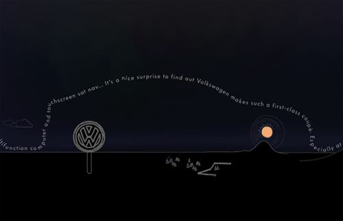
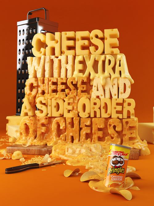
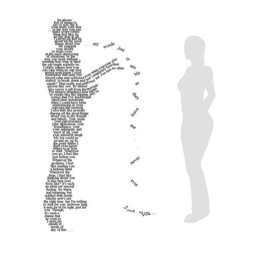
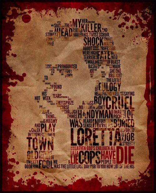
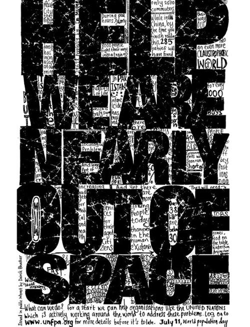
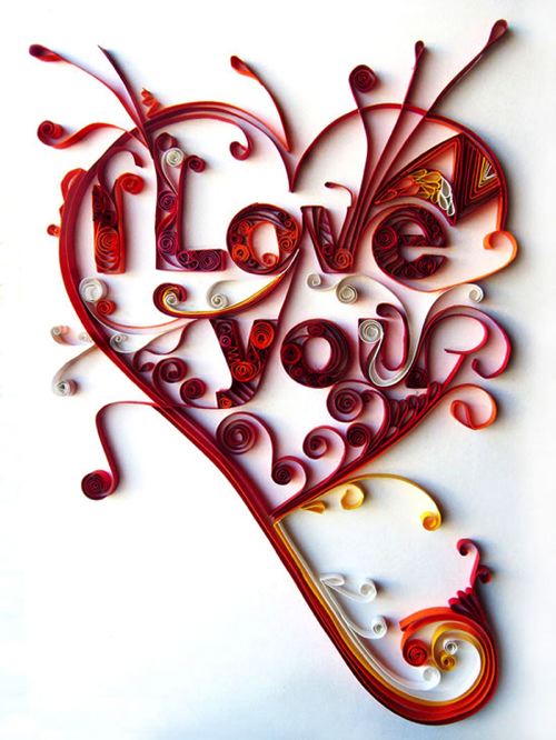
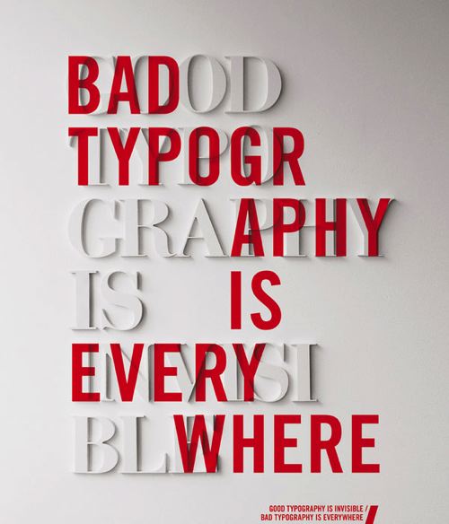
Of course, rules are made to be broken, and typography can really benefit from creativity that is firmly rooted in a mastery of the basics. Check out the examples below to see just how creative typography can be.